New look. New technology. New approach.
There‚Äôs a lot that‚Äôs shiny about pilipili¬˛ª≠‚Äôs new website, which launches this coming Wednesday, October 20. But what hasn‚Äôt changed is the critical role the web plays in telling the Dalhousie story to prospective students and assisting current students, faculty and staff in accomplishing their day-to-day tasks.
 |
| Here's a peek at the new Dalhouse homepage. |
|
What‚Äôs launching next week‚Äîmore than 700 pages of redesigned, rewritten web content‚Äîis the culmination of over a year‚Äôs work by the web project, a cross-departmental collaboration that includes leadership from Communications and Marketing, ITS and the Registrar‚Äôs Office. It operates under the strategic direction of the university‚Äôs executive team.¬Ý
Ready to launch
 |
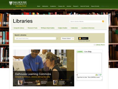
| Screen capture of the Libraries homepage. |
The new website doesn’t yet extend through the entire Dalhousie web presence, but it covers a sizable chunk of territory for a first effort. It includes all major sites that live off the Dal homepage and then some, a list that includes (among others):
- Admissions
- Academics (with a new program directory)
- Dal Libraries
- Campus Life
- Money Matters
- Athletics
- Research
- About pilipili¬˛ª≠
- Alumni and Friends
- (Dal News is getting a new look, but won’t be moving over fully to its new navigation and layout until later this fall)
There are also several new and noteworthy applications and features launching alongside those sites, including:
- A digital campus map built on the Google Maps interface
- A tuition estimate calculator¬Ý
- A directory of internal links organized by group (current students, faculty & staff, alumni, etc.)
The project’s goal was to provide as much value as possible for the university’s web users under a very tight timeline, according to James Covey, manager of Dal’s web team. That process was aided by external consulting partner Non-Linear Creations.
“A lot of people burned midnight oil to get us to this point,” says Mr. Covey, adding that the central web team’s expansion to include new developers and content writers was crucial.
“They’ve really put their all into this website, along with the important contributions of the content providers whose sites were being reworked.”
Green grows the web
 |
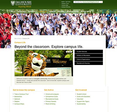
| Green is the new main color of the revamped Dal website. This screen capture shows the page when you hit the link 'Campus Life' from the homepage. |
When users visit the new Dalhousie homepage, they’ll see big, bright images and a consistent navigation throughout the site. But what many will notice first is the green, taken from Dalhousie’s colour palette and placed at the centre of the new design.
‚ÄúWe looked at a number of design proposals, using the whole range of Dal colours, but time and time again we returned to the green,‚Äù says June Davidson, acting assistant vice-president of Communications and Marketing. The design, which weaves Dalhousie black and gold throughout along with accents of blue and red, also received thumbs-up from prospective and current students during usability testing.¬Ý
“It’s a warm and inviting first-look for our web visitors,” adds Ms. Davidson. “It also performs better on the various screens used to view our pages.”
The website is built in Dalhousie’s new CQ5 content management system—a platform which the web team explains is more flexible, functional and simple to use compared to the vast majority of website software presently being used at the university. When combined with a user-centric approach to web content, the system will help web content providers build and maintain better, more robust websites to inform Dalhousie stakeholders—from prospective students through alumni—of what the university has to offer.
"When we talk to students, we hear how important it is that they can find the information they need, when they need it," says Susan Dorey-Power, associate registrar and director of recruitment. "This web relaunch has been a great opportunity to think critically about how we organize the crucial information on our website and to use this new tool to start building a better online experience for everyone.
“It's been a rewarding process for us, and we hope the results are equally as rewarding for our current and future students."
What’s next
The relaunched website marks an important milestone for the web project, but the work continues. The team is now beginning work on two strategic initiatives: revamped pages to describe Dalhousie’s 200+ programs and a new organization of the university’s student services information on the web. Staff are also starting plans to convert existing department and faculty pages into the new design and CQ5 system, as well as hoping to make significant gains in developing the university’s internal web capabilities, including the my.dal portal.
‚ÄúWe‚Äôre building more than a website,‚Äù says Mr. Fischer. ‚ÄúWe‚Äôre developing a communications platform that is intuitive, sustainable and empowers others to create useful, professional¬Ýcontent for our varied stakeholders.
‚ÄúWe‚Äôve been telling people about this vision for over a year now. The new public website¬Ýis our first chance to really show everyone what it means.‚Äù
